One of our assigned readings for class (Felton 2006) talked about the importance of the overall look and feel of an ad; essentially, the ad's format. Felton gives 7 suggested layouts to use as a type of "checklist" when developing an ad. I have taken the time to find all seven, using various types of Starbucks coffee advertisements as examples.
1. Standard Layout:
Starbucks has a lot of ads that are in the standard layout form; Illustration, Headline, copy, logo. I chose this one because 1) I thought it was semi-humorous, and 2) It reminded me of the statistic mentioned in the reading and in class that 4 out of 5 people do NOT read beyond the headline of ads. Starbucks uniquely defies the rules of advertising in this ad by stressing the point that they don't even have to think of something good to say in order to get people to buy their coffee.


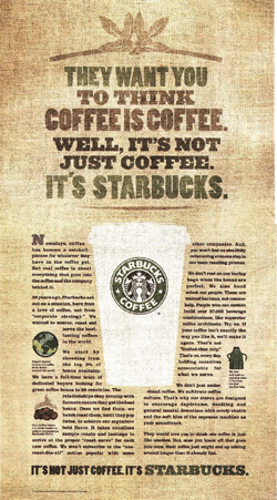
2. Editorial Layout:
In my opinion, the editorial layout is the most boring of them all, however I found this one to be very aesthetically pleasing. The ad uses effective treatment of the typography. I also find that the way the symbols pull the viewer through the copy of the ad is very successful as well. This may not, however, be the best example of an editorial ad because it is a little image-heavy.

3. Poster Layout:
As opposed to the editorial, the poster layout is my personal favorite. This ad includes a captivating image with complimentary text positioned neatly in the bottom right next to the logo. Beautiful!


4. Cartoon Layout:
I had some trouble finding an example for this one. This Starbucks "Go with the Flow" ad seemed to fit in the sense that they are trying to express more of an abstract idea with this never-ending-using-only-one-line "cartoon" of a coffee cup.

5. Comic Strip Layout:
This ad is actually screen shots of a Starbucks television ad aired in Britain. When viewed in screen shot form it serves its purpose for one of my examples as a comic strip layout. A cute holiday narrative about "passing the cheer (aka: steamy hot cup of Starbucks)" to an awkward-looking Christmas reindeer on a ski lift. Really gives you the warm fuzzes by the last window.


6. Picture-Caption Layout:
I found this ad off the Starbucks website, advertising two of their featured drinks. Maybe not the best ad but it gets the job done. It directly shows the picture of the drink and clearly states the name in a caption above.


7. Picture-Cluster Layout:
Pretty self-explanatory, but this ad is a "vintage" Starbucks ad with a montage of different images and pictures, of Starbucks coffee in its various forms. It shows many different facets of the product, the coffee being enjoyed, the coffee in action being poured, and the coffee in its packaging.


No comments:
Post a Comment